How to Graph Specialised Growth with Two Production Possibility Curves
In response to my post on How to Graph a Production Possibilities Frontier in Excel 2007 and Excel 2003, several people have asked how to chart two production possibilities curves, so I have created the amendment for Excel 2010, which is substantially similar to Excel 2007, and the concepts still apply to Excel 2003, though the mechanics are different. Some texts reference these curves as PPC, PPF, or PPFC. No matter, they all server the same function, which is to graphically represent opportunity costs.
From the Insert menu, select Scatter, and choose the one with smooth lines and markers—unless you do not want markers.
The key is simply add the second item to be represented on the Y-axis; otherwise follow the same steps for a single curve,
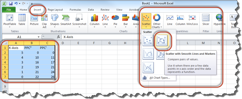
The resultant chart will appear like this:
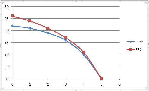
If you wish the specialisation to appear on the X-axis instead of the Y-axis, simply reverse the values for these on both data series. And there you have it. For details on how to swap X- and Y-axis data, refer to my post on Graphing Supply and Demand Curves in Excel.
How to Graph a Production Possibilities Frontier in Excel 2007
A few days ago I create a post named How to Graph a Production Possibilities Frontier in Excel 2003, and I thought it might be helpful to demonstrate the difference regarding How to Graph a Production Possibilities Frontier in Excel 2007.
NB: I also have a post on How to Graph Specialised Growth with Two Production Possibility Curves in Excel 2010.

As shown above, enter your production possibilities data for the two goods, and then go to the Insert tab where you will find chart options. Simply click Scatter to drop down sub-options, where you should select a graph with lines—unless you have many data points, in which case you may have enough points to see the relationship. When you click the sub-option, your chart will appear on the page.
At this point, you can configure your chart by giving titles, labels, axes, and the like. Click the chart object you created and a set of menus will appear menu to do this. I hope this helps.
How to Graph a Production Possibilities Frontier in Excel 2003
Here is a step-by-step tutorial showing how to create a Production Possibilities Frontier (Curve) in Excel 2003. The concept carries forward to creating a PPC in Excel 2007, too.
If you are reading this, I presume you know what a PPC is; you just want to know how to chart it. For those who somehow just stumbled here, I provide a concise definition.
A Production Possibilities Frontier is a graphical depiction of opportunity costs; given two competing possibilities, you must choose how you wish to allocate resources to make a determination of output, but as you move to increase one item, you must trade off some amount of the other item. The maximum (optimally efficient) production possibilities are captured by the (typically) concave curve, beyond which you do not have the resources to acheive and inside the curve. The actual combination of outputs depends on preferences, a decision beyond the scope of this example.
Open a blank Excel worksheet, and enter your data in separate columns for the two possibilities. Feel free to name the data in the top row. Note that one of your columns needs to be in ascending order, whilst the other needs to be in descending order. You may enter as few as 2 data points per item and as many as Excel allows. When you are done, highlight the data range, and invoke the Chart Wizard.

Graphing Supply and Demand Curves in Excel
I documented graphing a supply and demand schedule in Excel 2003 for my students. It can be adapted to other versions and applications. Click on an image to view it full size.
Having the data available to Excel, highlight the data, and then click the Chart Wizard icon on the toolbar.

Highlight Data Range
A chart wizard will be presented, providing you with some options. Select XY (Scatter), and choose one of the linear models, as shown. (You may choose another chart type, but since I know these data are linear, this selection works fine.) Then click next.

Excel Chart Wizard - Scatter Chart
Here comes the important part. By convention, supply and demand graphs present price on the Y-axis and quantity on the X-axes. Excel will present these in reverse, so you need to modify the data on the Series tab. You also need to rename Quantity Supplied (Qs) from the schedule to Supply and Quantity Demanded (Qd) to Demand, as shown in the next three images.

Update Series Data
When you first visit the series tab, the data looks like the image above. You need to reverse the X and Y axis data and add a name. The curves you are making are supply and demand curves—not quantity supplied and quantity demanded. Your goal is to ensure both of these series share the same Y axis data, which in this example resides in column B.

Reverse Supply Axis and Rename to Supply

Reverse Demand Axis and Rename Demand
Click next to label the graph appropriately.

Label the Graph
Make any other changes you like, as I have below—change the scale, labelling, colours, and such—, then click finish to see the results of your labour. That’s it. You’re done.

View the Graph in Excel

3 comments