Kyle Saves the Economy
Watch South Park’s take on the current financial crisis, or just witness behind the scenes how the US Department of the Treasury makes tough choices.
Proportional versus Progressive Taxation Homework Template
Please note that the template to this assignment is here.
Graphing Supply and Demand Curves in Excel
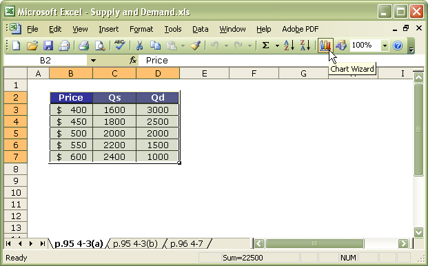
I documented graphing a supply and demand schedule in Excel 2003 for my students. It can be adapted to other versions and applications. Click on an image to view it full size.
Having the data available to Excel, highlight the data, and then click the Chart Wizard icon on the toolbar.
A chart wizard will be presented, providing you with some options. Select XY (Scatter), and choose one of the linear models, as shown. (You may choose another chart type, but since I know these data are linear, this selection works fine.) Then click next.
Here comes the important part. By convention, supply and demand graphs present price on the Y-axis and quantity on the X-axes. Excel will present these in reverse, so you need to modify the data on the Series tab. You also need to rename Quantity Supplied (Qs) from the schedule to Supply and Quantity Demanded (Qd) to Demand, as shown in the next three images.
When you first visit the series tab, the data looks like the image above. You need to reverse the X and Y axis data and add a name. The curves you are making are supply and demand curves—not quantity supplied and quantity demanded. Your goal is to ensure both of these series share the same Y axis data, which in this example resides in column B.
Click next to label the graph appropriately.
Make any other changes you like, as I have below—change the scale, labelling, colours, and such—, then click finish to see the results of your labour. That’s it. You’re done.
Proportional versus Progressive Taxation Template
The Proportional versus Progressive Taxation Template for assignment W3 is available.


leave a comment